|
Chevron, symbol of purity
In ancient Aegean, Egyptian and
Romanesque art, the chevron was a
prominent ornamental design motif. In 19th century France, it was a
military
mark of rank and distinction. In Great Britain, the chevron
signifies the purity of a gold or silver object.
Small wonder that in 1931,
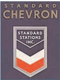
Standard Oil Co. of California adopted a three-bar
chevron design in the company’s distinctive red, white and blue colors. The
reasons
for the design were two-fold: to identify the company’s products and services
with quality and to catch the eye of the passing motorist.
The new design marked quite a
departure from the earliest logo of the Pacific
Coast Oil Company, a Chevron predecessor founded in 1879. Set off in heavy
script letters adorned with a flourish of serifs, the company name frequently
appeared on a backdrop of wooden derricks set among California’s hills,
signifying
Coast Oil’s first oil discovery at Pico Canyon.
Chevron, bar none
The adoption of the three-bar
chevron proved so effective that the company
began to use the word "Chevron" on products, beginning with lubricating oils in
1937, then solvents, culminating with Chevron gasoline in 1945.
To signify support for the
Allied Forces’ war effort during World War II, the company
added a "winged V" — symbolizing victory — as the fourth letter in
the Chevron name.
One company, one look
Shortly after World War II,
Standard Oil Co. of California developed a new sign —
"Chevron Gas Station" — for display at the cream, green and
burgundy-hued outlets
of thousands of independent dealers. In 1955, the company adopted the
Chevron hallmark as a uniform symbol for all product packages.
A Chevron gas station with
its "Hallmark" design, featuring a
flat
roof and clean, contemporary lines.

To identify its products and services with
quality and to catch the eye of the passing
motorist, Standard adopted a three-bar
chevron design in the company's distinctive
red,
white and blue colors in 1931.
Chevron History Branding

While Chevron was repainting more
than 7,000 station
pumps in a new color scheme and adding the Chevron name plate, the company built
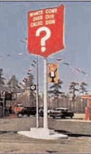
up suspense by placing over the Calso signs a red bag that
read: "What's come over our Calso sign?"
The Chevron hallmark also was
represented on the company flag, the stacks of
ships and employee uniforms. Soon, it became synonymous with the company in
the 125 countries where it did business.
In 1946, Standard had developed marketing and
refining operations in the
Northeastern United States through its California Oil Company (Calso)
subsidiary.
For the next 12 years, it marketed products under the Calso name; its line was
designed in the colors and typefaces in harmony with the Standard family of
products.
Calso signs off
Based on the strength of the
national "Chevron" brand identity, Standard made
the decision in 1958 to convert all of its Eastern U.S. stations from Calso to
Chevron. This involved repainting more than 7,000 station pumps in a new color
scheme and adding the Chevron name plate.
During the transition, the
company placed over the Calso signs a red bag that
read: "What’s come over our Calso sign?" The public learned the answer when
the red bag was pulled away and the Chevron name and symbol appeared.
Making it official
Until the late 1960s, the name "STANDARD"
appeared in large block letters
beside the word "Chevron" and its familiar three stripes at company-owned
service
stations. In 1969, following a two-year study of its corporate identity, the
company
developed a new hallmark, consisting of two bold strokes of color topped by
the word "Chevron."
This new logo spread to all
retail outlets, packaging, and even stationery — in
short, wherever the company was represented.
The Chevron name became
predominant at many of its operating companies,
from the geophysical research subsidiary to the chemical company. When the
company reorganized in 1977, all U.S. operations were consolidated into Chevron
U.S.A. Inc.
The company took the next,
logical step in 1984, when it adopted Chevron
Corporation as the official corporate name, replacing Standard Oil Company of
California. This step coincided with the agreement to merge with Gulf
Corporation.
The logo displayed the word "Chevron"
on a white field,
above bold blue and red stripes.
Today, Chevron Texaco's service
stations are located across Asia, Europe,
Eurasia, Latin America and North America under the Chevron,
Texaco and Caltex brands. |

